完整代码:https://github.com/Xav1erSue/tour
本文于 2025 年 5 月 22 日完全重写,现为最新版
前言——为什么我们需要 Tour 组件
用户第一次使用我们的产品或者产品添加新功能时,我们通常需要让用户第一时间感知到功能的变化、使用方式等。一个最简单有效的方法就是,带着用户走一遍流程,这就是 Tour 组件所实现的事。
因此我们需要一个统一的引导组件去帮我们做这些脏活,提高代码的可读性和可维护性。
如何实现一个 Tour 组件
在着手实现之前,我们先来总结一下 Tour 组件需要具备的能力:
蒙层高亮:高亮是 Tour 组件最基本的能力之一
浮动定位:基于指定的高亮元素,我们需要将提示信息以指定的方位渲染在其身边
即时重绘:当页面发生滚动、元素发生位移,或是页面尺寸发生变化,我们要按照最新的页面尺寸以及元素位置更新高亮蒙层和浮动定位。
除了这几个能力之外,结合笔者负责业务线的特点,我们还提出了一个新的要求——跨平台,至少要同时能够支持 H5 和 Taro 小程序。
带着这些目标,我们逐一来看:
跨平台
在着手实现代码之前,我们先来聊聊跨平台的思路。
跨平台,也叫跨端,本质上是允许开发者通过前端的技术栈(HTML、CSS、JS)来编写不同设备端的应用,主流的思路如 electron 是直接打包 Chromium 来渲染网页,小程序、Tauri 等则是利用不同操作系统自带的 webview 来渲染网页,而 React Native 则做的更加彻底,直接使用原生组件渲染页面,只使用 JavaScript 引擎来执行 JS 代码。
现代前端开发离不开前端框架,实际上 React 就是一个非常适合做跨端的框架,其核心设计是平台无关的,其核心库仅包含 JS 代码,在浏览器环境中运行时,我们通过引入 React DOM 来完成页面渲染,这也是为什么诸如 RN、Taro 等跨端框架采用 React 的原因。
本文的目标只是实现一个 React 组件,我们希望的是,让这个组件可以在各种环境中都能使用,因此,我们在设计组件时,应当避免调用平台特定的一些 API,如在小程序 webview 环境无法访问 window 对象,也不能通过 document.appendChild 等方法来创建、挂载节点,其都有各自的语法。
参照一些设计的比较好的跨平台基础库,如 ReactDnD,面对此种场景的解法是将库进行分层,即平台无关的核心层,以及平台适配层,两者结合,就可以实现跨平台。
 1
 2
 3
 4
 5
 6
 7
 8
 9
10
| import { HTML5Backend } from 'react-dnd-html5-backend'
import { DndProvider } from 'react-dnd'
export default function MyReactApp() {
return (
<DndProvider backend={HTML5Backend}>
/* your drag-and-drop application */
</DndProvider>
)
}
|
那么我们也可以参照这种设计,将平台相关的 API 抽象出去,在核心库内调用抽象的方法,即可适配不同的平台。我们可以写出这样的一个类:
 1
 2
 3
 4
 5
 6
 7
 8
 9
10
11
12
13
14
15
16
17
18
19
20
21
22
23
24
25
26
27
28
29
30
31
32
33
34
35
36
| import { Promisable } from './types';
export interface Rect {
x: number;
y: number;
width: number;
height: number;
}
export interface VirtualElement {
readonly id: string;
[key: string]: any;
}
export interface VirtualWindow {
readonly innerWidth: number;
readonly innerHeight: number;
}
export abstract class Platform {
abstract readonly window: VirtualWindow;
/** 通过 id 查找元素 */
abstract getElementById(id: string): Promisable<VirtualElement | null>;
/** 通过 id 查找元素的 Rect */
abstract getElementRectById(id: string): Promisable<Rect | null>;
/** 创建元素 */
abstract createElement(): React.ReactElement;
/** 创建 SVG 元素 */
abstract createSVGImageElement(src: string): React.ReactElement;
/** 获取设备像素比 */
abstract getDevicePixelRatio(): number;
/** 监听窗口 resize 事件 */
abstract onResize(callback: () => void): { cleanup: () => void };
/** 监听窗口 scroll 事件 */
abstract onScroll(callback: () => void): { cleanup: () => void };
}
|
将我们可能需要的平台方法进行抽象定义,随后在需要适配的具体平台内重新实现这个类:
 1
 2
 3
 4
 5
 6
 7
 8
 9
10
11
12
13
14
15
16
17
18
19
20
21
22
23
24
25
26
27
28
29
30
31
32
33
34
35
36
37
38
39
40
41
| class PlatformH5 extends Platform {
window = window;
getElementById(id: string) {
return document.getElementById(id) as VirtualElement;
}
getElementRectById(id: string) {
const element = document.getElementById(id);
if (!element) {
return null;
}
return element.getBoundingClientRect();
}
createElement(): React.ReactElement {
return <div />;
}
createSVGImageElement(src: string) {
return <img src={src} />;
}
getDevicePixelRatio() {
return window.devicePixelRatio;
}
onResize(callback: () => void) {
window.addEventListener('resize', callback);
return {
cleanup: () => window.removeEventListener('resize', callback),
};
}
onScroll(callback: () => void) {
window.addEventListener('scroll', callback);
return {
cleanup: () => window.removeEventListener('scroll', callback),
};
}
}
|
并且我们同样使用 Context 来透传这些参数:
1
2
3
4
5
6
7
| const App: React.FC<React.PropsWithChildren> = ({ children }) => {
return (
<TourContext.Provider value={{ platform: new PlatformH5() }}>
{children}
</TourContext.Provider>
);
};
|
并且在组件内使用 useContext 来获取这些方法,如此一来,我们就可以实现跨平台。
蒙层高亮
目前在古茗内部的几个应用如门店宝和古茗学院等项目的引导功能,都是基于绝对定位展示图片,或是简单粗暴重新渲染一遍高亮组件的方式实现的,前者要求组件不能有可变换的形态(因为图片是固定的),后者则需要保证元素离开原有层级后样式不会丢失(例如后代选择器指定的样式)
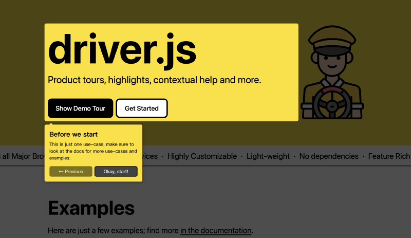
这两种方案都对业务有较强的侵入性,并且不具备通用性和灵活性,我们参考一些老牌的 Tour 组件如 Driver.js、ReacTours 等三方库,发现其实现方式大体都是基于 svg 绘制蒙层,给目标高亮元素挖洞的形式。
绘制 SVG
我们知道,SVG 可以通过 path 去绘制任何我们想要的路径,那么,我们完全可以在获取到元素属性后,给一张覆盖全屏的 SVG 蒙层挖洞。path 的 d 属性是由一个又一个命令拼合而成的,一个命令由字母+数字组合而成,例如
1
| <path d="M150 0 L75 200 L225 200 Z" />
|
这样的一条路径,就表示「开始于位置 150 0,到达位置 75 200,然后从那里开始到 225 200,最后在 150 0 关闭路径。」
具体的命令类型有如下这些:
- M = moveto
- L = lineto
- H = horizontal lineto
- V = vertical lineto
- C = curveto
- S = smooth curveto
- Q = quadratic Bézier curve
- T = smooth quadratic Bézier curveto
- A = elliptical Arc
- Z = closepath
p.s. 以上所有命令均允许小写字母。大写表示绝对定位,小写表示相对定位
基于这些命令,我们就可以写出一个生成蒙层路径的函数:
 1
 2
 3
 4
 5
 6
 7
 8
 9
10
11
12
13
14
15
16
17
18
19
20
21
22
23
24
25
26
27
28
29
30
31
32
33
34
35
36
37
38
39
| interface GenerateOverlayOptions {
/** window 宽度,在浏览器环境下是 window.innerWidth */
windowInnerWidth: number;
/** window 高度,在浏览器环境下是 window.innerHeight */
windowInnerHeight: number;
/** stage padding */
stagePadding?: number;
/** stage radius */
stageRadius?: number;
}
const generateOverlaySvgPathString = (
referenceRect: Rect,
options: GenerateOverlayOptions,
) => {
const {
windowInnerWidth,
windowInnerHeight,
stagePadding = 8,
stageRadius = 5,
} = options;
const stageWidth = referenceRect.width + stagePadding * 2;
const stageHeight = referenceRect.height + stagePadding * 2;
// prevent glitches when stage is too small for radius
const limitedRadius = Math.min(stageRadius, stageWidth / 2, stageHeight / 2);
// no value below 0 allowed + round down
const normalizedRadius = Math.floor(Math.max(limitedRadius, 0));
const highlightBoxX = referenceRect.x - stagePadding + normalizedRadius;
const highlightBoxY = referenceRect.y - stagePadding;
const highlightBoxWidth = stageWidth - normalizedRadius * 2;
const highlightBoxHeight = stageHeight - normalizedRadius * 2;
return `M${windowInnerWidth},0L0,0L0,${windowInnerHeight}L${windowInnerWidth},${windowInnerHeight}L${windowInnerWidth},0Z
M${highlightBoxX},${highlightBoxY} h${highlightBoxWidth} a${normalizedRadius},${normalizedRadius} 0 0 1 ${normalizedRadius},${normalizedRadius} v${highlightBoxHeight} a${normalizedRadius},${normalizedRadius} 0 0 1 -${normalizedRadius},${normalizedRadius} h-${highlightBoxWidth} a${normalizedRadius},${normalizedRadius} 0 0 1 -${normalizedRadius},-${normalizedRadius} v-${highlightBoxHeight} a${normalizedRadius},${normalizedRadius} 0 0 1 ${normalizedRadius},-${normalizedRadius} z`;
};
|
有了这个函数,我们就可以拼接出一个 SVG 图片字符串了。
渲染 SVG
有了 SVG 图片字符串,如何渲染也是一个问题,在浏览器环境中,我们可以使用 new Blob 和 URL.createObjectUrl 来将 SVG 字符串转为图片地址,然后利用 img 标签的 src 属性直接渲染 SVG 图片。
 1
 2
 3
 4
 5
 6
 7
 8
 9
10
| const svgStr = `<svg
version="1.1"
xmlns="http://www.w3.org/2000/svg"
viewBox="0 0 ${window.innerWidth} ${window.innerHeight}"
>
<path d="${generateStageSvgPathString(stagePosition)}" />
</svg>`;
const svgFile = new Blob([svgStr], { type: 'image/svg+xml' });
const svgUrl = URL.createObjectURL(SvgFile);
|
但在小程序中,我们无法访问 Blob 对象,这种方案显然是不行的,我们的另一个思路是,将 SVG 图片转为 Base64 字符串,并使用 Base64 字符串渲染图片,但是很可惜小程序中仍然不支持 bota 方法,你可以自行实现一个,也可以使用现成的 base64 库如 js-base64。随后,我们再使用一个平台无关的 createSVGImageElement 方法来创建渲染 SVG 图片的元素,如此一来就可以成功渲染 SVG 图片了。
 1
 2
 3
 4
 5
 6
 7
 8
 9
10
11
12
13
14
15
16
17
18
19
| const Overlay: React.FC<OverlayProps> = (props) => {
const { referenceRect, windowInnerWidth, windowInnerHeight } = props;
const { platform, overlayClassName = 'tour-overlay' } =
useContext(TourContext);
const pathString = generateOverlaySvgPathString(referenceRect, {
windowInnerWidth,
windowInnerHeight,
});
const svgStr = `<svg version="1.1" xmlns="http://www.w3.org/2000/svg" viewBox="0 0 ${windowInnerWidth} ${windowInnerHeight}"><path d="${pathString}" /></svg>`;
const svgUrl = 'data:image/svg+xml;base64,' + encode(svgStr);
const element = platform.createSVGImageElement(svgUrl);
return React.cloneElement(element, { className: overlayClassName });
};
|
效果如下:

浮动定位
有了蒙层之后,我们还需要渲染出 Popover,这里有一个浮动定位的逻辑在,就是我们经常看的环绕布局,这个有现成的库,Floating UI,Floating UI 也是一个支持跨平台的库,但是因为我们整个库都已经做了跨平台的设计,因此再实现一遍 Floating UI 的平台适配也意义不大,我们可以按照 Floating UI 的思路写一个简化版。
Floating UI 是以中间件的形式,通过对一次定位指定多个不同功能的中间件,共同得出最后的结果,例如一次 bottom-start 的定位可能会经历如下几个中间件:
- 根据高亮元素的位置算出自己绝对定位于元素左下角的位置
- 加上既定的偏移量
- 根据高亮元素的尺寸,设置浮动元素的尺寸
- 计算浮动元素相对视口是否产生了溢出,如果有溢出,则翻转处理
这样我们就可以计算出浮动元素最终的位置了。
computePosition
Floating UI 的核心是 computePosition 函数,其接受两个元素(参考元素和浮动元素)及一个配置选项,我们定义其类型如下:
 1
 2
 3
 4
 5
 6
 7
 8
 9
10
11
12
13
14
15
16
| type Side = 'top' | 'right' | 'bottom' | 'left';
type Align = 'start' | 'end' | 'center';
type Placement = `${Side}` | `${Side}-${Align}`;
interface ComputePositionOptions {
placement?: Placement;
platform: Platform;
middlewares: Middleware<unknown>[];
}
function computePosition(
reference: VirtualElement,
floating: VirtualElement,
options: ComputePositionOptions,
): Promise<Position>;
|
首先我们使用 platform 中的 getElementRectById 方法获取参考元素和浮动元素的原始位置及尺寸:
1
2
3
4
| const [referenceRect, floatingRect] = await Promise.all([
platform.getElementRectById(reference.id),
platform.getElementRectById(floating.id),
]);
|
随后,将定位选项 placement 解析为方位和排列,并计算出不经过中间件的初始位置。这里的逻辑较为繁琐,我们可以按照方位和排列分别来看:
方位分为 top、bottom、left、right 即上下左右四个方位,如果浮动元素定位在上方,我们可以确定其 y 坐标应当为参考元素的 y 坐标减去过那个元素的高度,如下图所示:

而 x 坐标则会受到排列方式的影响,无法确定,因此我们在这一步只记录 y 坐标。其他方位计算方式也同理,我们可以得到基础坐标:
1
2
3
4
5
6
| const sideOffsets: Record<Side, Position> = {
top: { x: 0, y: referenceRect.y - floatingRect.height },
bottom: { x: 0, y: referenceRect.y + referenceRect.height },
left: { x: referenceRect.x - floatingRect.width, y: 0 },
right: { x: referenceRect.x + referenceRect.width, y: 0 },
};
|
再结合排列,如 top-end,我们就可以确定其 x 坐标了,如下图所示:

同理,我们可以得到结合了 side 和 align 的坐标计算结果:
1
2
3
4
5
6
7
8
9
10
11
12
13
14
15
16
17
18
19
20
21
22
23
24
25
26
27
28
29
30
31
32
33
34
35
36
37
38
39
40
41
42
43
44
45
46
47
48
49
50
| const alignOffsets: Record<Align, Record<Side, Position>> = {
start: {
top: { x: referenceRect.x, y: 0 },
bottom: { x: referenceRect.x, y: 0 },
left: {
x: 0,
y: referenceRect.y + (referenceRect.height - floatingRect.height) / 2,
},
right: {
x: 0,
y: referenceRect.y + (referenceRect.height - floatingRect.height) / 2,
},
},
end: {
top: {
x: referenceRect.x + referenceRect.width - floatingRect.width,
y: 0,
},
bottom: {
x: referenceRect.x + referenceRect.width - floatingRect.width,
y: 0,
},
left: {
x: 0,
y: referenceRect.y + (referenceRect.height - floatingRect.height) / 2,
},
right: {
x: 0,
y: referenceRect.y + (referenceRect.height - floatingRect.height) / 2,
},
},
center: {
top: {
x: referenceRect.x + (referenceRect.width - floatingRect.width) / 2,
y: 0,
},
bottom: {
x: referenceRect.x + (referenceRect.width - floatingRect.width) / 2,
y: 0,
},
left: {
x: 0,
y: referenceRect.y + (referenceRect.height - floatingRect.height) / 2,
},
right: {
x: 0,
y: referenceRect.y + (referenceRect.height - floatingRect.height) / 2,
},
},
};
|
最终将两者相结合,就可以得到基础的坐标定位了:
1
2
3
4
5
| const sideOffset = sideOffsets[side];
const alignOffset = alignOffsets[align][side];
x = sideOffset.x + alignOffset.x;
y = sideOffset.y + alignOffset.y;
|
中间件
单纯有了基础坐标定位,还不能成为一个通用组件,在实际业务开发中,我们往往会遇到各种各样的场景,例如选择器的下拉框,要和输入框保持一致的宽度;浮动元素超出视口时,要将其翻转到对称的下方。我们可以使用中间件的形式来进行自定义实现。
类似于后端开发中的中间件概念,其本质上就是一系列共享同一份上下文的函数,每一次执行都会将执行结果传递给下一个中间件。参考 Koa 的中间件逻辑,我们使用一个 ctx 对象来传递上下文,其包含参考元素、浮动元素、坐标、平台适配器、方位和排列等内容。
1
2
3
4
5
6
7
8
| interface MiddlewareContext {
reference: VirtualElement;
floating: VirtualElement;
position: Position;
platform: Platform;
side: Side;
align: Align;
}
|
中间件则通过传入指定的配置项,返回处理函数完成注册:
1
2
3
4
5
6
7
8
9
10
11
12
| interface Middleware<T = any> {
name: string;
options: T;
fn: (ctx: MiddlewareContext) => Promisable<MiddlewareContext>;
}
const middleware = (options: MiddlewareOptions): Middleware<OffsetOptions> => ({
name: 'middleware',
options,
fn: (context) => context
});
|
以一个基础的偏移(Offset)中间件为例,其逻辑如下:
1
2
3
4
5
6
7
8
9
10
11
12
13
14
15
16
17
18
19
20
21
22
23
24
25
26
27
28
29
30
31
32
33
34
35
36
37
38
39
40
41
42
43
44
45
46
| export interface OffsetOptions {
offsetX?: number;
offsetY?: number;
}
export const offset = (options: OffsetOptions): Middleware<OffsetOptions> => ({
name: 'offset',
options,
fn: (context) => {
if (context.side === 'top') {
if (options.offsetY) {
context.position.y = context.position.y - options.offsetY;
}
if (options.offsetX) {
context.position.x = context.position.x + options.offsetX;
}
}
if (context.side === 'bottom') {
if (options.offsetY) {
context.position.y = context.position.y + options.offsetY;
}
if (options.offsetX) {
context.position.x = context.position.x + options.offsetX;
}
}
if (context.side === 'left') {
if (options.offsetX) {
context.position.x = context.position.x - options.offsetX;
}
if (options.offsetY) {
context.position.y = context.position.y + options.offsetY;
}
}
if (context.side === 'right') {
if (options.offsetX) {
context.position.x = context.position.x + options.offsetX;
}
if (options.offsetY) {
context.position.y = context.position.y + options.offsetY;
}
}
},
});
|
拿到配置选择中的 x 和 y 坐标的偏移,结合方位,来决定往哪个方向进行偏移。
同理我们可以写出一个翻转(Flip)中间件,以 top 方位布局为例,我们检测浮动元素的 x 坐标是否小于 0,如果小于则说明其发生了移除,需要进行翻转,我们更新 side 属性为翻转后的方位,并将 y 坐标相对参考元素进行翻转,如下图所示:

Flip 中间件通常在最后执行,否则可能会出现在其之后调用的中间件修改了定位导致溢出的情况
其他方位的翻转也大同小异,画个图就能理清楚,这里就不多赘述,直接上完整代码:
1
2
3
4
5
6
7
8
9
10
11
12
13
14
15
16
17
18
19
20
21
22
23
24
25
26
27
28
29
30
31
32
33
34
35
36
37
38
39
40
41
42
43
44
45
46
47
48
49
50
51
52
53
54
55
56
57
58
59
60
61
62
63
64
65
66
67
| const FLIP_MAP: Record<Side, Side> = {
top: 'bottom',
bottom: 'top',
left: 'right',
right: 'left',
};
export const flip = (): Middleware => ({
name: 'flip',
options: {},
fn: async (context) => {
const [referenceRect, floatingRect] = await Promise.all([
context.platform.getElementRectById(context.reference.id),
context.platform.getElementRectById(context.floating.id),
]);
if (!referenceRect || !floatingRect) return;
if (context.side === 'top' && context.position.y <= 0) {
context.side = FLIP_MAP[context.side];
context.position.y =
referenceRect.y +
referenceRect.height +
referenceRect.y -
context.position.y -
floatingRect.height;
}
if (context.side === 'left' && context.position.x <= 0) {
context.side = FLIP_MAP[context.side];
context.position.x =
referenceRect.x +
referenceRect.width +
referenceRect.x -
context.position.x -
floatingRect.width;
}
if (
context.side === 'bottom' &&
context.position.y + floatingRect.height >=
context.platform.window.innerHeight
) {
context.side = FLIP_MAP[context.side];
context.position.y =
referenceRect.y -
floatingRect.height -
context.position.y +
referenceRect.y +
referenceRect.height;
}
if (
context.side === 'right' &&
context.position.x + floatingRect.width >=
context.platform.window.innerWidth
) {
context.side = FLIP_MAP[context.side];
context.position.x =
referenceRect.x -
floatingRect.width -
context.position.x +
referenceRect.x +
referenceRect.width;
}
},
});
|
如果你想要实现其他效果,也可以按照类似的方式进行实现。随后我们将注册中间件的逻辑补充到主函数 computePosition 中:
1
2
3
4
5
6
7
8
9
10
11
12
13
14
15
16
17
18
19
20
21
22
23
24
25
26
27
28
29
30
31
32
33
34
35
36
37
38
39
40
41
42
43
44
45
46
47
48
49
| const computePosition = async (
reference: VirtualElement,
floating: VirtualElement,
options: ComputePositionOptions,
): Promise<Position> => {
const { placement = 'bottom', platform, middlewares } = options;
const [referenceRect, floatingRect] = await Promise.all([
  platform.getElementRectById(reference.id),
  platform.getElementRectById(floating.id),
]);
let x = 0;
let y = 0;
if (!referenceRect || !floatingRect) {
return { x, y };
}
const [side = 'bottom', align = 'center'] = placement.split('-') as [
Side,
Align,
];
const sideOffsets: Record<Side, Position> = {};
const alignOffsets: Record<Align, Record<Side, Position>> = {};
const sideOffset = sideOffsets[side];
const alignOffset = alignOffsets[align][side];
x = sideOffset.x + alignOffset.x;
y = sideOffset.y + alignOffset.y;
const ctx: MiddlewareContext = {
reference,
floating,
position: { x, y },
platform,
side,
align,
};
for (const middleware of middlewares) {
await middleware.fn(ctx);
}
return ctx.position;
};
|
至此,我们已经完成了浮动定位的核心逻辑。
useFloating
单有核心逻辑还不够,为了适配 React 组件,我们还需要将其封装进一个 Hook 内,来完成调用,我们期望的调用形式是这样的:
1
2
3
4
5
6
7
8
9
10
11
12
13
14
15
16
17
18
| export default function () {
const { refs, floatingStyles, update } = useFloating({
placement: "bottom",
platform,
middlewares: [offset({}), flip()],
});
useEffect(() => {
update();
}, [update]);
return (
<React.Fragment>
<div ref={refs.reference}></div>
<div ref={refs.floating} style={floatingStyles}></div>
</React.Fragment>
);
}
|
也有什么特殊逻辑,直接看代码吧,几个注意点是自定义 Hook 的返回函数尽可能使用 useCallback 和 ref 来保证外部调用时可以随心所欲地将函数加入依赖数组,并且避免闭包陷阱(这里的 useLatest 可以参考 ahooks )
 1
 2
 3
 4
 5
 6
 7
 8
 9
10
11
12
13
14
15
16
17
18
19
20
21
22
23
24
25
26
27
28
29
30
31
32
33
34
35
36
37
38
39
40
41
42
43
44
45
46
47
48
49
50
51
52
53
54
55
56
57
58
59
60
61
62
63
64
65
66
67
68
69
70
71
72
73
| export const useFloating = (options: UseFloatingOptions) => {
const { placement, platform, middlewares, strategy = 'fixed' } = options;
const placementRef = useLatest(placement);
const platformRef = useLatest(platform);
const middlewaresRef = useLatest(middlewares);
const reference = useRef<VirtualElement | null>(null);
const setReference = useCallback((element: VirtualElement | null) => {
reference.current = element;
}, []);
const floating = useRef<VirtualElement | null>(null);
const setFloating = useCallback((element: VirtualElement | null) => {
floating.current = element;
}, []);
const refs = useMemo(
() => ({
reference,
setReference,
floating,
setFloating,
}),
[reference, setReference, floating, setFloating],
);
const [position, setPosition] = useState<Position>();
const update = useCallback(async () => {
if (!reference.current || !floating.current) {
return;
}
const options = {
placement: placementRef.current,
platform: platformRef.current,
middlewares: middlewaresRef.current,
};
const position = await computePosition(
reference.current,
floating.current,
options,
);
setPosition(position);
}, [placementRef, platformRef, middlewaresRef]);
const floatingStyles = useMemo<React.CSSProperties>(() => {
if (!position)
return {
position: strategy,
left: '0',
top: '0',
};
const dpr = platform.getDevicePixelRatio();
const toPx = (value: number) => `${Math.round(value * dpr) / dpr}px`;
return {
position: strategy,
left: toPx(position.x),
top: toPx(position.y),
};
}, [position, strategy, platform]);
return {
refs,
floatingStyles,
update,
};
};
|
至此,我们完成了浮动定位的全部逻辑。
动态更新
上文有提到因滚动、页面尺寸变化等原因导致需要重新生成蒙层和定位,在 Floating UI 中是使用 autoUpdate 实现的,其原理也是在元素挂载后监听 resize 和 scroll 事件,这个逻辑我们就不在浮动定位模块内包了,而是再封装一个 useHighlight Hook 统一处理。
在 useHighlight 中,我们期望最终就是给外部暴露一个 highlight 函数来进行针对指定 id 元素的高亮,在其内部我们需要封装蒙层/弹出层的渲染、元素获取以及事件监听等逻辑。
值得一提的是,由于我们期望做的是平台无关的组件库,因此事件监听我们使用 platform 提供的抽象方法,代码如下:
1
2
3
4
5
6
7
8
9
10
11
12
13
14
15
16
17
18
19
20
21
22
23
24
25
26
27
28
29
30
31
32
33
34
35
36
37
38
39
40
41
42
43
44
45
46
47
48
49
50
51
52
53
54
55
56
57
58
59
60
61
62
63
64
65
66
67
68
69
70
71
72
73
74
75
76
77
78
79
80
81
82
83
84
85
86
87
88
89
90
91
92
93
94
95
96
| export const useHighlight = (props: UseHighlightProps) => {
const { onDestroy } = props;
const onDestroyRef = useRef(onDestroy);
onDestroyRef.current = onDestroy;
const { platform } = useContext(TourContext);
const [placement, setPlacement] = useState<Placement>();
const [referenceRect, setReferenceRect] = useState<Rect | null>(null);
const [popover, setPopover] = useState<React.ReactNode>();
const { refs, floatingStyles, update } = useFloating({
placement,
platform,
middlewares: [offset({ offsetY: 20 }), flip()], // 中间件注册
});
const destroy = useCallback(() => {
setReferenceRect(null);
setPlacement(undefined);
setPopover(undefined);
refs.setReference(null);
refs.setFloating(null);
onDestroyRef.current?.();
}, [refs]);
useLayoutEffect(() => {
const handleResize = async () => {
if (!refs.reference.current) return;
const rect = await platform.getElementRectById(refs.reference.current.id);
setReferenceRect(rect);
};
const { cleanup: cleanupResize } = platform.onResize(handleResize);
const { cleanup: cleanupScroll } = platform.onScroll(handleResize);
return () => {
cleanupResize();
cleanupScroll();
};
}, [refs.reference, platform, update]);
const highlight = useCallback(
async (
id: string,
popover: React.ReactNode,
placement: Placement = 'bottom',
) => {
const [targetNode, targetNodeRect] = await Promise.all([
platform.getElementById(id),
platform.getElementRectById(id),
]);
if (!targetNode || !targetNodeRect) {
return console.error(`targetNode is not found!`);
}
refs.setReference({ ...targetNode, id });
setReferenceRect(targetNodeRect);
setPopover(popover);
setPlacement(placement);
},
[refs, platform],
);
useEffect(() => {
update();
}, [referenceRect, update, placement]);
const renderOverlay = () => {
if (!referenceRect) return null;
return (
<Overlay
referenceRect={referenceRect}
windowInnerWidth={platform.window.innerWidth}
windowInnerHeight={platform.window.innerHeight}
/>
);
};
const renderPopover = () => {
if (!referenceRect) return null;
return (
<Popover style={floatingStyles} setRef={refs.setFloating}>
{popover}
</Popover>
);
};
return {
highlight,
destroy,
renderOverlay,
renderPopover,
};
};
|
至此,所有核心逻辑都已完成
API 设计
上述底层的 API 只是为了实现功能,但真正想要打造一款优秀的三方库,API 设计是重中之重。好的 API 设计,不仅可以帮助开发者理解使用方式,还能够拥有极高的灵活性和可拓展性。
一个很好的思路是,先设计 API,再实现代码,这有点类似于 DDD(Domain-Driven Design,领域驱动设计),在写三方库的时候是一个很不错的思路。
因为我们使用 React 技术栈,因此我们的顶层 API 会暴露一个 useTour Hook,结合 Driver.js 的配置化,我们期望的调用形式是这样的:
1
2
3
4
5
6
7
8
9
10
11
12
13
14
15
16
17
18
19
20
21
22
23
24
25
26
27
28
29
30
31
32
33
34
35
36
37
38
39
40
41
42
43
44
45
46
47
48
49
50
51
52
53
54
55
56
57
58
59
| const steps: TourStep[] = [
{
id: 'step-1',
placement: 'bottom-start',
popover: ({ next, destroy }) => (
<Card
title="step 1"
actions={[
{ label: 'cancel', onClick: () => destroy() },
{ label: 'next', onClick: () => next() },
]}
>
<div>content</div>
</Card>
),
},
{
id: 'step-2',
placement: 'bottom-start',
popover: ({ next, destroy }) => (
<Card
title="step 2"
actions={[
{ label: 'cancel', onClick: () => destroy() },
{ label: 'next', onClick: () => next() },
]}
>
<div>content</div>
</Card>
),
},
{
id: 'step-3',
placement: 'bottom-start',
popover: ({ destroy }) => (
<Card
title="step 3"
actions={[{ label: 'cancel', onClick: () => destroy() }]}
>
<div>content</div>
</Card>
),
},
];
export default function() {
const { start, renderOverlay, renderPopover } = useTour({ steps });
return (
<React.Fragment>
<button onClick={() => start()}>start</button>
<div id="step-1">step 1</div>
<div id="step-2">step 2</div>
<div id="step-3">step 3</div>
{renderOverlay()}
{renderPopover()}
</React.Fragment>
);
};
|
用一个 step 参数维护需要高亮的元素、弹层内容以及顺序。此外我们将 render 方法暴露出去,避免对 React 做手动渲染(如调用 ReactDOM 的 createRoot 等),完全交由外部进行渲染,这样天然就规避了跨平台操作节点的繁琐代码。
废话不多说,直接上代码,非常简单,因为我们已经将高亮的逻辑受控到 useHighlight 中了:
 1
 2
 3
 4
 5
 6
 7
 8
 9
10
11
12
13
14
15
16
17
18
19
20
21
22
23
24
25
26
27
28
29
30
31
32
33
34
35
36
37
38
39
40
41
42
43
44
45
46
47
| import { useCallback, useEffect, useState } from 'react';
import { TourStepContext, UseTourProps } from './types';
import { useHighlight } from './use-highlight';
export const useTour = (props: UseTourProps) => {
const { steps } = props;
const [currentStepIndex, setCurrentStepIndex] = useState(-1);
const { highlight, destroy, renderOverlay, renderPopover } = useHighlight({
onDestroy: () => setCurrentStepIndex(-1),
});
const next = useCallback(() => {
if (currentStepIndex < steps.length - 1) {
setCurrentStepIndex(currentStepIndex + 1);
}
}, [currentStepIndex, steps]);
const start = useCallback(
(index: number = 0) => setCurrentStepIndex(index),
[],
);
useEffect(() => {
const currentStep =
currentStepIndex >= 0 ? steps[currentStepIndex] : undefined;
if (!currentStep) return;
const context: TourStepContext = {
next,
destroy,
index: currentStepIndex,
step: currentStep,
};
const popover =
typeof currentStep.popover === 'function'
? currentStep.popover(context)
: currentStep.popover;
highlight(currentStep.id, popover, currentStep.placement);
}, [currentStepIndex, highlight, steps, next, destroy]);
return { next, destroy, start, renderOverlay, renderPopover };
};
|
看看效果:

非常棒,我们成功实现了一个 Tour 组件。
总结
本文介绍了从零开始构建一个完整的跨平台 Tour 组件的设计思路和实现方式,参考了老牌引导组件库 Driver.js、ReacTour 和定位库 Floating UI 的实现方式,取长补短,使代码拥有了比较良好的架构设计、较强的可读性和可维护性,并且还拥有很强的拓展性。
相关代码具备一个引导组件的主要基础功能,但想作为一个主流的方案选型仍需要花费较多精力打磨,因此本文主要目的还是为读者和笔者自身提供学习思路,提高编码和设计能力。
相关阅读